
DAVID JUSTH, M.S.
Design Research & Strategy
Human factors-trained sensemaker with an extensive track record of bringing integrity, thoughtfulness, and value creation to experiences large and small
This collection of case studies introduces four projects presented in expanded executive summary formats, along with a few artifacts for context. For each project, detailed presentations are available for live shareouts.
Available upon request: other client projects, reports, and research papers
Project #1
How to reduce marketing costs by creating a more targeted SEO/SEM strategy through research
Employer: Viator
Duration: 6 weeks
Tools: Mural
Roles: Researcher, Content Designer
Project Features:
Product Strategy
Descriptive meta-analysis
Expert review

Diagram 1: Click image to view hi-res PDF
Sample of thematic synthesis
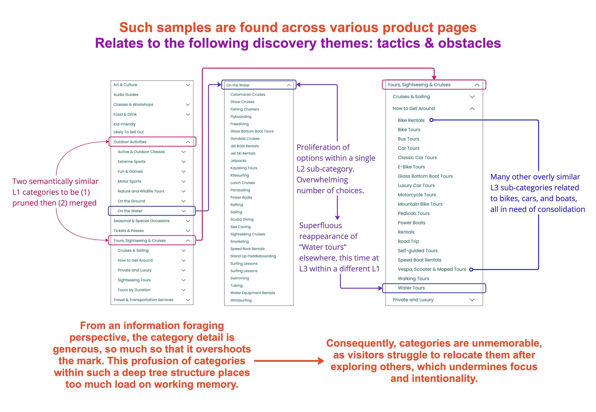
Diagram 3: Click to view hi-res PDF
Snapshot of site-wide taxonomy challenges
What motivates people to travel? Which information sources do they trust? Which devices do they prefer? What kinds of emotional bonds are formed?
As part of my employment with Viator, one of the world’s largest travel excursion sites, I conducted a meta-study of primary research to systematically assess such research questions. The effort, in part, revealed opportunities that speak to how the company can alleviate sizable SEO/SEM expenses by better meeting customers where they are through factors related to personalization and the psychology behind how humans search for information.
Viator’s vision is twofold:
To become the easiest site for travel research, planning, and booking
To deliver the highest quality tours and activities so that customers develop confidence and company loyalty
Business Goal:
Translate actionable findings into design solutions with an eye toward reducing the high number of customers who land on product pages “sideways,” in particular Google, to which Viator pays high sums for SEO & SEM.
Note: This is an unsurprising challenge. “Googlling” long ago entered the English lexicon for good reason: the affordance of easy search, which alleviates demands on memory. It has not only developed into common procedural (how-to) knowledge, but even a cognitive bias unto itself, The Google Effect, a.k.a. digital amnesia.
Research Goals:
Understand travel engagement through multiple dimensions (attitudinal, behavioral, practical, etc.)
Explore the potential value in offering a planning solution that gives customers a place to save, organize, become inspired, and ultimately make decisions. Would such a thing potentially increase conversions? Items booked per trip? Loyalty?
Methods:
I had access to 21 primary research reports, which drew from 106 participants total and aligned around 7 research questions, all of which yielded considerably diverse information. 2 lengthy rounds of affinity mapping were the most economical ways to capture, organize, code, re-code, and filter data. The first employed grounded theory; the second a straightforward thematic analysis. See Diagram 1.
Findings, Insights, Themes:
Dozens of findings and insights surfaced in relation to goal #1 above. A small sample of themes:
Cross-referencing and vetting choices through a variety of channels boosts confidence in final choices.
Experienced travelers tend to curate info from quick Google searches, set an itinerary, and make separate bookings through various site. As predicted, a direct threat to Viator.
Great imagery makes even premium travel seem more realistic and possible.
🚩 Red flag: Data surfaced 10 traveler archetypes, which, curiously, deviated substantially from 5 in-house personas.
Data also surfaced dozens of key signals about — and insights into — planning styles, thematically relating to their:
Identities
Priorities
Values
Triggers
Tactics
Obstacles
Too many to address in this format. Detailed findings & insights addressed at shareout.
Solutions, Next Steps, Opportunities:
Viator’s strength — its deep directory of product listings — is also a weakness insofar as the site largely presents itself as a directory, which can be hard to relate to. As for the research goals, Viator’s top 3 opportunities are:
Represent common traveler segments by developing content funnels around those archetypes for personalization reasons. Content curated around at least 3 categories — food, geography, and a destination’s local resources — should be front & center.
Diagram 2 outlines some…
Good news: 1 of these 3 funnels (food) is now coming into existence 👍
Bad news: 1 funnel (“geo-hubs”) remains undiscoverable due to substandard IA 👎
Bad news: Nothing pertaining to local resources exists yet 👎
Just-as-bad news: Unlike the 10 archetypes surfaced in the meta-study, the 3 aforementioned content categories (food, etc.) aren’t represented among in-house personas 👎
In-house personas appear to be at least partially flawed
Help travelers be more intentional, goal-oriented, in control, and less overwhelmed. This directly relates to IA governance, specifically taxonomy. See Diagram 3. In conjunction with improved personalization, there are opportunities to re-develop mental models through enhanced:
Bolster faceted search options
Focused search: e.g., berrypicking 🍓
Exploratory search: e.g., information foraging
Guided search: primarily for reasons related to personalization and geography (“geo-hubs” mentioned above)
Translate desires for authenticity, nostalgia, and quintessence.
Impact, Business Outcomes:
I wrote a short but persuasive treatise on the above issues, which was triangulated with existing research and included a series of actionable recommendations that were integrated into PM and Research roadmaps. Thanks in part to this work, and in conjunction with an expert review of booking processes I conducted, remedies to the most acute issues — at the intersection of personalization & IA governance — are currently underway.
Limitations of Primary Research
No shared mod guide
Little root cause analysis evident
Scant data re: satisfaction with resources (tools & sites)
Some kind of Kano modeling may have been useful here
~50/50 split between generic/composited data and granular data, which sacrificed:
Nuance
Quantitative accuracy
Interconnectedness of topics
Information germane to research goal #2
Limitations of Secondary Research
Secondary observer effect
Retrospective:
What did I learn?
How to perform a descriptive meta-analysis. I had been looking forward to attempting one.
A considerable amount about travel styles.
What could have gone better?
The project was rather monastic in nature, which led to occasional analysis paralysis
Grounded theory took longer than expected.
I was taking a challenging grad seminar at the time, which reduced the pace I wanted to move at.
What would I have done differently?
Lean on 1-2 colleagues for more frequent sanity checks.
What went well? What will I keep doing?
That said, I had time to do quality work, which helped me coherently wrap things up. This, in turn, led to the positive outcomes mentioned above.
Emotions
Influencers
Technology resources

Diagram 2: Click to view hi-res PDF
Snapshots of personalization & IA challenges
Project #2
Saving money by evaluating nursing attitudes toward speech recognition technology

Client: Nuance Communications
Duration: 14 weeks
Tools: Dovetail, Figma, Miro, Google Suite
My roles:
Researcher
Client liaison
Report co-author (40 pages)
Experience map designer
Participant map co-designer
Records manager
Other roles: PM, Research, Process Checker
Project Features:
Foundational / Generative
Formative

Diagram 1: Click image to view hi-res PDF
Experience Map
Client requested a detailed map
As frontline workers, nurses face myriad challenges. How do they communicate with colleagues and patients? How do they record and share patient information? What are their workflows and priorities?
From discovery to readout, 10 inpatient nurses shared their experiences, attitudes, and phenomenologies in a project both operationally and intellectually complex. In so doing, they largely demonstrated that technology isn’t the answer to every problem, which, in turn, saved the client from an unfruitful investment.
Context:
In high-acuity nursing environments (e.g., ICU, medical-surgical), the accurate recording of inpatient data is not only an essential component of quality healthcare, but also a physical communication tool among members of a patient’s care team. In hospitals across the U.S., despite the prevalence of charting — i.e., entering short-form patient data into EHRs (electronic health records) — there is ample evidence that nurses rely on other artifacts, typically paper, to collect and recall patient data for charting purposes.
While physicians have successfully adopted speech recognition technology to record patient data through narrative-like dictation (considered “documentation”), the process remains manual for nurses.
Business Goal:
Explore the feasibility of leveraging the client’s technology (DMO, DAX) for inpatient charting.
Research Goals:
Understand nursing workflows for patient data collection
Capture and explore their specific goals & motivations
Identify obstacles that prevent the realization of these goals & motivations
Propose and lightly validate concepts to help them overcome these obstacles
Methods:
To assess the current technological and attitudinal landscape, the study protocol began with a literature review of 25 journal articles about nursing workflows and the uses of voice technology in nursing.
For alignment purposes, 3 client stakeholder interviews helped formulate a 6 research questions, which helped give rise to a moderation guide.
Recruitment followed suit, relying upon a convenience sample that passed a screener: 10 semi-structured cognitive interviews.
Using Dovetail, data were coded in several phases using a shared code book. After surfacing early patterns in an initial grounded theory phase, we proceeded to successive rounds of thematic analysis by assigning structural and process codes to all interviews, to which I added elements of interpretative phenomenological analysis with an idiographic focus.
In-depth analysis was ultimately accomplished by having team members code interviews they neither moderated nor took notes for (for debiasing purposes). The process that yielded more than 100 discrete codes, 800 coding instances, and culminated in 40 core findings.
Findings, Insights, Themes:
With one exception, attitudes ranged from ambivalence, to reticence, to hostility. Accordingly, the primary conclusion is that this was a solution in search of a problem. Reasons and insights fell along several lines:
Unlike physicians who keep narrative-like records, nurses typically capture short, discrete bursts of information, which are additionally used as memory assists. This population didn’t view speech recognition tech as conducive to charting and note-taking.
For privacy reasons, participants couldn’t conceive of taking voice notes in front of loved ones, who are oftentimes in the room.
They negatively viewed the idea that (conscious) patients should be audibly exposed to jargon being spoken into an EHR.
While working in EHRs may still leave something to be desired — they have their own workflow issues — the prevailing attitude was: “Better the devil you know.” And while paper notes have minor shortcomings, such notes remain workable solutions. Moreover, paper notes are effortlessly passed between nurses during shift changes and don’t suffer from glitches or WiFi issues. Most fundamentally, these notes are deeply ingrained behavioral habits not be easily abandoned, and voice tech was largely considered yet another digital tool to interfere with nurse-patient interaction.
Interestingly, a minor finding worth reporting was a lack of concern surrounding the quality of speech recognition.
Impact, Business Outcomes:
Nuance abandoned this line of inquiry after triangulating these results with existing research, which held similar findings. With independent studies validating each other, the inquiry’s removal from the roadmap ultimately saved the client further financial and staffing resources by avoiding investment in an area that, at present, demonstrates signs of being largely unreceptive to this technology.
Next Steps, Opportunities, Recommendations:
Despite the above results, speech recognition technology is more than just voice dictation. Final recommendations regarding its use in this context:
Investigate the potential intersection of speech recognition technology with communication devices already used in these settings, if not for charting, then at least for note taking.
Investigate potential correlations surfaced through the participant spectrum map (Diagram 2). Nurses who work at hospitals that require structured, templated note-taking also reported that charting has a “very high impact” on work-life balance (due to EHR workflow issues).
Identify clinics that do not allow paper into the patient’s room due to COVID-19. If this practice is enforced in more inpatient settings than what our convenience sample found, it could be an opportunity at least for voice-enabled note taking.
Continue exploring ways to replace paper as a stopgap solution for quickly adding highly structured information to an EHR system. Utilize a participatory design method like a charrette with nurse participants, which would serve well.
Continue this line of inquiry with the next generation of nurses, as there are some signals that that youngest practitioners were at least more receptive to this tech.
Limitations:
Observation and interviews in situ would have been ideal. This likely would’ve been possible in a pre-COVID world. Regrettably, it wasn’t an option at the time of this study.
Recruitment fell a bit short of the minimum 12 participants desired. (Why 12? See here and here if you’re really, really interested.)
Patient technicians, who also play a role in high-acuity patient care, would have been welcome. But recruitment limitations unfortunately did not allow for this.
Coding and analysis took longer than expected, which led to a deviation from the protocol’s final step: a charrette with nurses. However, there was time to involve client stakeholders in a blue-sky ideation activity, which yielded welcome out-of-the-box solutions.
Retrospective:
What did I learn?
An abundance of methodological skills applied to a critical subject area.
There are signs that nursing attitudes will eventually, albeit slowly, evolve. While it’s currently a slow-moving train, I’m curious to see how that changes as NLP and AI catch fire in new ways each year.
What would I have done differently?
Aside from sticking to a better sleep schedule, for a change I honestly can’t think of anything I would’ve done differently.
What went well? What will I keep doing?
The client was deeply engaged at every turn.
Keep my cool, and my nose to the grindstone. A demanding schedule tried collective patience, but it was sink or swim and the focus was to stay afloat.
To that end, team cohesion, candor, and engagement were paramount to success, a unity that resulted in psychological safety, a good deal of productivity, and interpersonal satisfaction. All primary objectives were meaningfully met, including final client presentations and documentation handoff.

Diagram 2: Click to view hi-res PDF
Participant Spectrum Map
Project #3
Defining an opportunity space for the discount prescription giant

Client: GoodRX
Duration: 2 months
Tools: Miro, Google Suite
My roles:
Protocol development
Competitive & heuristic analyses
Moderation guide
Metrics selection
In-depth interviews
Report co-authoring
Project Features:
Foundational / Generative
Formative
Summative
Content Design
Diagram 1: Click to enlarge
Visual summary of competitive landscape analysis
Diagram 2: Click to enlarge
Thematic groups
Diagram 3: Click to enlarge
Sample of thematic findings
In a bid to increase customer retention and lifetime value, GoodRx sought to expand beyond its core prescription discount service. In so doing, a bespoke usability study doubled as discovery in that it additionally explored a sizable new opportunity space: the wellness management arena. The hybrid approach tested aspects of the GoodRx app while simultaneously surfacing themes surrounding people’s emotional tolls and evolving strategies.
Current Mission:
To help people navigate the United States’ very complicated health system.
Business & Research Goals:
Help the company expand into a more holistic space built around a “Managing Illness” theme
Then optimize existing features for doing so by engaging users to participate in the app experience beyond prescription-oriented tasks
Understand the current customer journey
Then uncover actionable opportunities to enhance the lives of those with ongoing or chronic health problems
Two-Stage Protocol & Primary Findings:
Part 1: Size up the competition
Conduct heuristic analyses of the GoodRx app alongside 3 leading wellness apps.
Fold into a detailed competitive landscape analysis. See Diagram 1 for overview.
Part 2: Test and discover
Having settled upon a hybrid generative-evaluative moderation guide and assessment metrics, this stage drew from 11 semi-moderated interviews. These participants:
Represented 11 different illnesses
Used a total of 16 different wellness apps
Primary screener criterion: participants who struggled with at least one chronic health condition
Test and evaluate 3 app features in varying orders, including time on task and whether task completion required assistance
Task 1 — Find medication coupons: Tested well 👍👍
Takeaway: This is GoodRx’s bread and butter and was a gimme, so no surprise here. However…
Caveat #1: In the absence of clarifying language, the option to sort meds by “popularity” was confusing (i.e., popular to whom??)
Caveat #2: From signal detection and visual hierarchy perspectives, the coupon screen deprioritizes what relevant information it does offer on illness management
Task 2 — Find a health condition: Tested moderately well 👍
Takeaway: Easy to perform
Caveat: Many of the participants’ conditions were missing, and some of the ones that weren’t were information-poor
Task 3 — Find medication resources: Tested poorly 👎
Takeaway: The quality, organization, and purpose of GoodRx’s current supporting resources stands to be clarified, which are additionally underserved by being decentralized and effectively hidden. With GoodRx doing one thing well for many years, its brand has solidified. Few could conceive of using it to manage their illnesses in holistic ways.
Discovery:
Thematic groups: Diagram 2
Sample of thematic findings: Diagram 3
Next Steps, Opportunities, Recommendations:
From the perspective of managing an illness, GoodRx did not exceed anyone’s expectations, but this wasn’t wholly surprising. It must first develop and test new content funnels, perhaps in the form of a resource hub, starting with (but far from limited to) the takeaways and caveats addressed above. To woo people away from the competition, these funnels should be flexible, accessible, reassuring, customizable, and cognitively easy to engage with.
Product teams must keep front of mind that customers will sometimes engage with the app under emotional, cognitive, and/or behavioral strain.
When ready, they would also need to reconsider the app’s IA, starting with elevating such content to the same level as its coupons, e.g., a spot in the primary navigation.
In the crowded wellness app space, a formidable undertaking awaits GoodRx should it pursue this initiative. If this new functionality becomes robust enough to be generally considered all-in-one, thereby sufficiently sidelining the competition, it’d ideally exist within the GoodRx Gold subscription for monetization reasons (after a free trial period).
Should it succeed in these efforts, and to distance itself from being exclusively known for discount prescriptions, it might consider removing “Rx” from its name.
Impact, Business Outcomes:
This work introduced the first critical assessment of how much GoodRx helps users with their particular illnesses. It surfaced not only what was missing in direct app interactions, but also ancillary issues confronted by those with chronic illnesses.
After 2 separate hour-long presentations to the GoodRx product team, findings and recommendations were very well received. Many thanked us for bringing clarity and inspiration to the initiative, which has been integrated its product roadmap, being designated for its subscription plan.
Primary Limitations:
With the “Managing Illness” theme in its nascence, this ideally would have been a project with a deeper generative component followed by the assessment of proposed solutions. But circumstances constrained us to test only the current app. However, there was a trade-off. While greater depth and breadth of discovery was sacrificed, most usability results were news to product teams, which was due to a focus on the app’s core function (couponing) over other aspects it offers, but hasn’t built out yet.
Testing would’ve ideally been conducted between subjects, but time constrained recruitment, resulting in within-subjects participation.
Project #4
Easing mental burdens associated with student loan debt

Client: Chime Financial
Duration: 2 months
Tools: Figma, Miro, Google Suite
My roles: Research, Content Design
Other roles: Research, Visual Design
Project Features:
Foundational / Generative
Formative
Summative
Content Design
Visual Design
In 2022, American college students collectively owed $1.75 trillion in student loan debt, with 44% of fully employed borrowers saying they couldn’t afford monthly loan payments or were in default.
From discovery to readout, a team explored a problem space fraught with angst. With an eye toward healthier financial living, we sought, and ultimately provided, Chime members with tools that afford greater agency through integrated loan repayment and goal-setting.
Mission Statement:
“Everyone deserves financial peace of mind.”
Business Goals:
Research and develop a new opportunity space for Chime Financial.
Support college students and/or recent graduates with student loan debt, which, in turn, helps maintain positive and sustainable financial health.
Methods:
Moving from the abstract to the concrete, a dozen divergent & convergent activities — including 12 participants (7 generative + 5 formative & summative) — helped narrow scope before arriving at viable solutions, with exploration, ideation, and validation driving design evolution. All team members contributed to each step.
Discovery Themes:
Generative research quickly and steadfastly revealed sharply negative emotions surrounding student loan debt. Among many findings, 2 primary themes surfaced:
Debt accumulation feels insurmountable and imposes a sizable mental burden on borrowers
Education about the complexities of student loans is lacking at many levels, breeding deep resentment
Solutions:
5 concept tests yielded the development of 2 prototyped sets of tools — guided goal-setting & payment rules — allowing members to consistently set aside customizable amounts of money.
Impact, Business Outcomes:
Task flows demonstrably enhanced the value of the existing app by creating a more comprehensive money management system for Chime members, which was our remit. Chime enthusiastically embraced final deliverables, signaling it would integrate the following into its product roadmap the first discovery theme, starting with the solutions we prototyped.
Recommendations, Next Steps:
Test where loan management would reside in current app ecosystem
Identify other opaque loan processes in need of special guidance/support
Identify optimal mobile data visualizations to support comprehension of loan progress and goal creation
Success metrics:
SUS of 2 main flows: payment rules and goal-setting
Ascertain % of users who create payment rules after completing goal-setting flow (as contrasted with % currently using Chime’s Round Up rule)
Primary Limitation:
Given the ever-familiar constraint — time — we opted to focus on interventions related to the reduction of mental burdens (first theme above). In so doing, we set aside a more education-oriented solution (second theme, a more systemic problem) for future-focused research.
Retrospective:
What did I learn?
Just how tricky it is to design at the intersection of behavior and emotion in a financial space.
What could have gone better?
Chime requires a SSN to use and, for security purposes, team members were unwilling to use their own to personally gain access to the app. Chime was also unable to provide a test environment, design system, or even a UI kit. While they did provide some generic screenshots and a style guide, we largely had to fly blind with respect to app behavior and flows, relying instead on what could be pieced together from YouTube videos.
What would I have done differently?
I would’ve been more judicious in scoping proposed solutions, to stay: (1) better focused within time constraints, and (2) avoid feature creep.
What went well? What will I keep doing?
Team members and client stakeholders meaningfully contributed to all steps and got along interpersonally. Consequently, despite stumbles, there were no lasting regrets, but rather valuable takeaways that will improve future collaborations.